
How to motivate your audience with a data presentation
Presenting data is a crucial factor in the corporate decision-making process. It also contributes to the professional development of an executive. Many business decisions are based on data analyses that need to be visualized and communicated clearly. This process affects several professions that are based on the analytical way of thinking, such as engineers, researchers, statisticians, etc. but it is not limited to them.
Presenting the results of a data survey is the final stage in an analysis process. Unfortunately, in most of the cases, the data presentation stage is perceived by many people as of secondary importance and is not given the appropriate amount of attention.
If somebody wishes to motivate and persuade their audience with the results of their research, then they should carefully create a successful data visualization and avoid boring and generalized presentation practices.
Below are 4 tips for great data visualizations.
1/ Choosing the right chart type
Choosing the right chart is the main challenge in data visualization. Some executives are not aware of what chart to adopt and they tend to use the same chart type (e.g., pie charts) for various occasions. This is a sloppy practice that should be avoided because each chart type serves a different visualization purpose.
Choosing the right type of chart depends largely on the message and the audience. It is not the data, nor the variables that determine which chart should be selected. Rather, it is the message the speaker wishes to communicate.
For example, the following figure shows a company's product exports by country. The pie chart used on the left side simply explains that the business operates in different regions. But it is not easy to understand visually the differences between the variables.
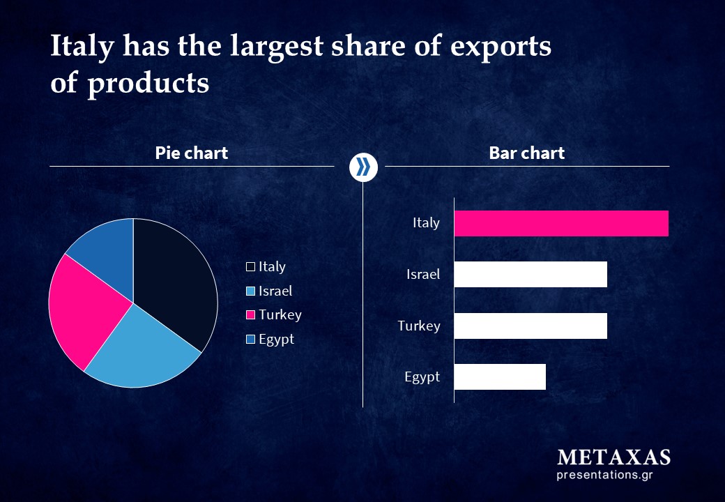
Alternatively, the stacked rows on the right side of the figure ranks the variables from largest to smallest and render the comparison easier for the human eye.
2/ Appropriate depiction of the key take aways
Data alone doesn't say much on a slide. It is necessary to support them with the appropriate message.
The message should be expressed in such a way as to motivate the audience to do what the speaker is suggesting. In order to achieve this, it should be expressed in complete sentences with a verb.
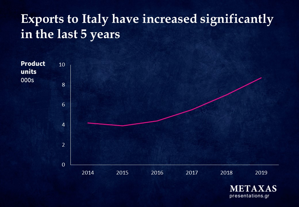
The diagram should be in a format that supports the conclusions. For example, in the diagram below the title "Exports to Italy have increased significantly in the last 5 years" supports the curve of the figure which depicts an increase.
3/ Appropriate use of colors
Before the human brain analyzes the contents and meaning of a graph, it recognizes it as an image. There are basic charting techniques that can be applied to guide the viewer to the desired information.
One of these techniques is the use of color to draw the eye to important parts of a diagram.
Human eyes are attracted by color. Humans are built so that color catches their attention. For this reason, when telling stories with data it is suggested to use colors that encourage the audience to take action.
For example, in the following image the purple color deliberately guides the eye to Egypt and prompts the viewer to take action on the matter.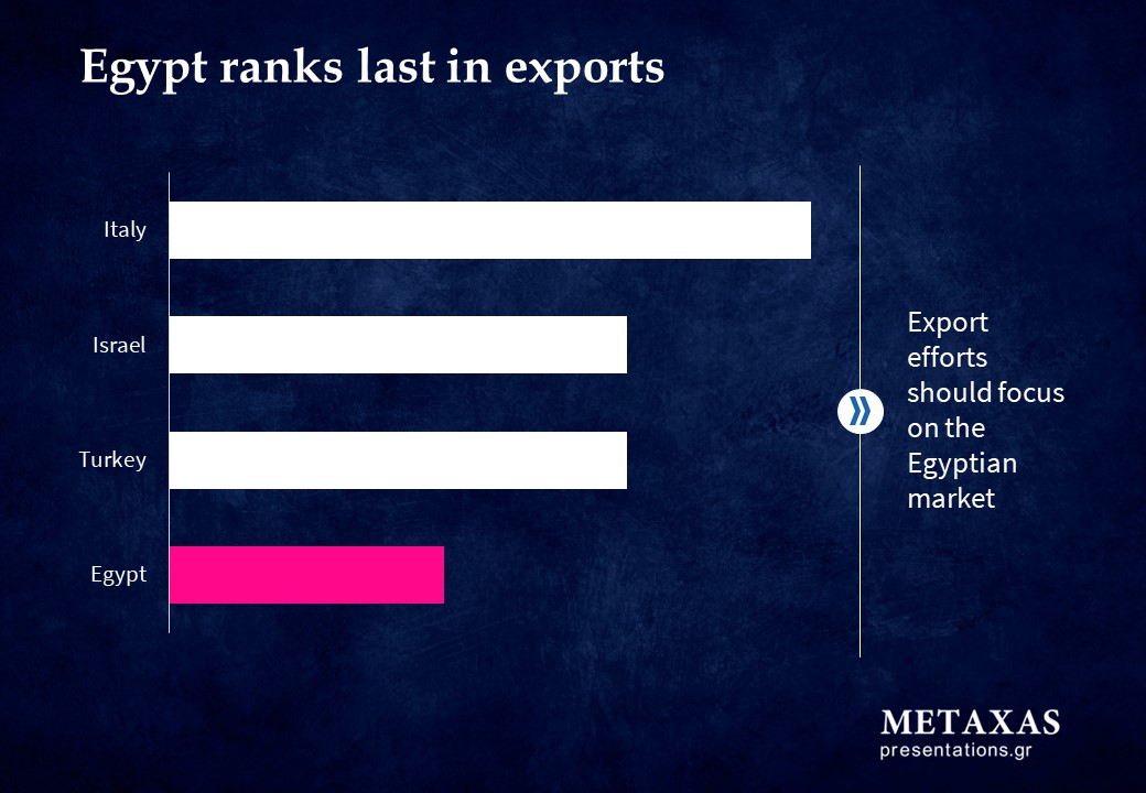
4/ Transition to the data slide
The transition to data slide is important and requires attention. It is helpful for the speaker to provide all the necessary information regarding the "Why" and "How" of the data.
- Why was this data set collected?
- How was their collection and processing carried out?
Let's work together.
Find the service or training that meets your needs. Send an email to discuss your needs.
